
Trail Mint: A little more adventure in the way we discover travel
Travel starts long before someone packs a bag. It starts when a photograph catches their attention, when a destination sounds interesting, or when an unfamiliar place suddenly feels worth exploring.
Trail Mint is a concept travel platform built around that moment.
The idea was to create a website for small-group adventures that feels welcoming and full of character, without making the practical side of planning a trip unnecessarily complicated.
The challenge
Travel websites have quite a lot to communicate.
A visitor wants to know where they can go, how long a trip lasts, what it costs, what is included and whether the experience suits them. Present everything at once and the page becomes exhausting. Hide too much and the visitor has to work to find an answer.
For Trail Mint, we wanted to find a comfortable middle ground.
The experience needed to feel adventurous without becoming unpredictable, and informative without resembling a booking spreadsheet.
That meant giving equal attention to three things: the destinations, the information people need to make a decision, and the personality of the brand.
Finding the visual direction
We started with a visual language that feels closer to a travel journal than a conventional booking portal.
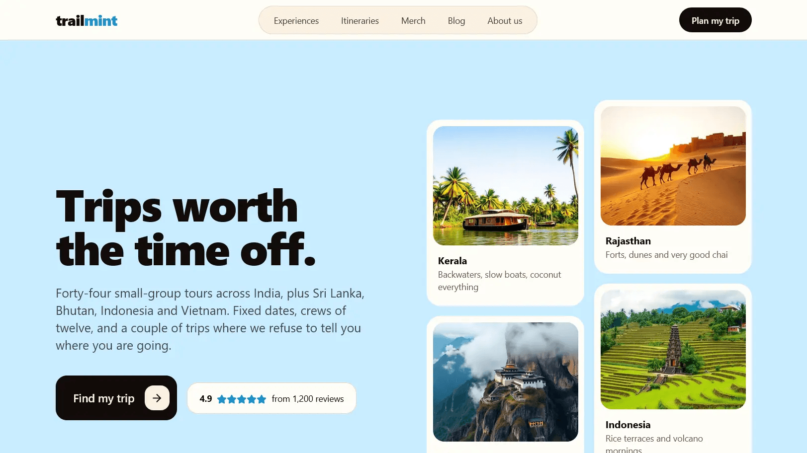
Warm sand tones give the interface a relaxed foundation. Sky blue adds a sense of openness and provides a recognisable accent for navigation, categories and smaller details. Dark typography keeps the content readable and gives important messages enough weight.
The typography follows a similar balance. Bold, expressive headings establish character, while simpler body text handles the information visitors need to read carefully.
Destination photography carries much of the emotional weight.
The homepage introduces places such as Kerala, Rajasthan, Bhutan and Indonesia through an image-led collage. Rather than asking visitors to examine a catalogue immediately, it first gives them something to imagine.
The result is an interface with a distinct personality, but one that still leaves room for the destinations themselves.
Helping people find their kind of trip
We organised the experience around the different ways people approach travel.
Some know exactly where they want to go. Others have a few days free and want suggestions. Some are looking for a short experience rather than a full itinerary.
The website accommodates these different starting points through separate sections for destinations, itineraries, shorter experiences and signature travel formats.
Trip cards are structured to present relevant information such as duration, location and price together. The itinerary catalogue also includes filters for destination, trip length and travel series.
This approach applies a simple principle of cognitive fluency: information is easier to understand when people can recognise its structure without having to decode it.
We also used progressive disclosure to keep the browsing experience approachable. A visitor can explore an overview first and move into the details when something catches their interest.
The goal was not to remove information. It was to make it available at the right moment.
Giving curiosity a place in the experience
One of Trail Mint's more interesting concepts is its mystery-trip format.
Instead of revealing every destination in advance, the brand introduces journeys where part of the experience is not knowing exactly where the traveller will end up.
That idea gave us an opportunity to work with the psychology of anticipation.
A destination-led travel website normally tries to answer where, when and what. Here, deliberately leaving one answer open creates intrigue.
We treated these signature formats differently from conventional itinerary cards, giving their stories room to explain the experience before asking visitors to make a decision.
It's a useful reminder that clarity and curiosity are not opposites. An interface can make the practical details clear while leaving the experience itself exciting.
Building confidence through the small details
People can enjoy browsing a travel website and still hesitate before making an enquiry.
The next step needs to feel understandable.
For Trail Mint, we placed emphasis on clear action labels, visible trip information, straightforward contact routes and a simple explanation of how group travel works.
The homepage breaks the process into three stages: choosing a route, joining a departure and showing up for the experience.
Rather than relying on a long explanation, the structure gives visitors a quick mental picture of what comes next.
The interface also uses restrained interaction. Cards respond subtly to hover, buttons offer visible feedback, and the navigation adapts to smaller screens.
These details are quiet, but they help the experience feel responsive and easier to navigate.
More than a collection of attractive pages
The project was also an exercise in building a content-managed travel platform.
We developed the website with Next.js, TypeScript and Tailwind CSS, using Supabase for its data and administrative foundation.
The underlying system supports itinerary management, departure scheduling, seat requests, booking administration, customer enquiries and editorial content.
A custom administration area allows travel information to be managed without editing the website's source code for every change. Rich-text editing is handled through TipTap.
This separation matters because travel information changes frequently. Departures, prices, availability and destination details need to be manageable independently of the interface presenting them.
The website also includes individual pages for experiences and itineraries, along with supporting content areas for the brand's story, articles and merchandise.
Together, these pieces establish a foundation that can support a broader travel catalogue as content is added.
The outcome
Trail Mint demonstrates how a travel platform can bring personality and practical usability into the same experience.
The visual direction makes room for discovery. The information architecture helps visitors move from inspiration to evaluation. The content-management foundation gives the concept room to grow beyond a static presentation.
As a concept project, it has no verified customer acquisition, booking conversion or commercial performance results to report. Its value lies in the implemented design direction, browsing experience and application structure.
For us, the central idea remains simple: a travel website should make the journey easier to understand without taking away the excitement of imagining it.
Project: Trail Mint
Type: Independent concept project